Working with housing data, not in Excel
, .
I use closed data in many Northern cities to understand housing markets. I wanted to see how well open data could replicate that and extend the method to the whole of England and Wales. Lots of people got in touch to ask me how I did it. So I’ve written this.
Phase 1: Getting all your data.
Before you can work with data, you need data, and you need to be allowed to use it. In England and Wales we often have excellent open data which we can use for anything we like. Here we’re going to be using,
- Prices paid dataset. A list of every property sale since 1995 in England and Wales (this is not strictly an open dataset but it is free and fine to use for this project).
- The ONS Postcode Directory. A link between every postcode in the UK and other geographies.
- LSOA level indices of multiple deprivation scores and deciles for England.
In total that’s about 5.5GB, so I hope you’ve got good broadband.
Phase 2: Sticking your data together.
Now I need to stick the data together. First I need to understand what I’ve got.
I’ve already done work on the prices paid data so I know what columns mean what. And there’s good documentation too, which is useful because the columns themselves have no headers.
I use EmEditor to explore huge text files, including CSVs. Other free text editors (such as VIM) will let you do this too, but they aren’t as easy to use. And you don’t really need to do this.
There are 2.6 million postcodes in the UK and 25.5 million transactions in the England & Wales prices paid dataset. The data for this project isn’t going to work within Excel’s 1 million row limit. Which is why you need to use a database (or a programming language for data analysis like R, Python, C#, etc…). I tried to do the work in PowerBI and that doesn’t really work. So we’re using SQLite.
I load my data into SQLite because it’s a free and open database, with wide support, that saves data in a single file. And it’s extremely reliable. I use DB Browser for SQLite because it’s free and excellent and helps load data into a SQLite database, run queries, and save results. Create a new database, import a table from CSV, add some indexes, run some queries, export the results of the queries. DB Browser for SQLite makes all that pretty easy.
If you were doing this work in Excel you’d use VLOOKUP, or INDEX-MATCH if you’re a bit odd, to join information from across the three datasets you’re using. Even if Excel supported the number of rows you’d need to do that, it would take ages. You need indexes.
Since you’re going to join the two biggest tables on postcode you need to create an index on that field in both tables. DB Browser for SQLite will help you do that.
You’ll then need to write a query that does the calculation you want to do. SQL is like German, English people find it easier to read it backwards. So in this case I want to return new build sales only, whose sale type is not “other”, and by joining the postcode on the sales table with the postcode in the postcode directory I want to know the latitude and longitude of the sale in addition to its price, sale date, and postcode. Which in SQL is,
select field2 as price, field3 as saledate, field4 as postcode, lat, long
from [pp-complete] join ONS_Postcode_Directory__Latest__Centroids where [pp-complete].field4 = ONS_Postcode_Directory__Latest__Centroids.pcds
AND [pp-complete].field6 IS 'Y' AND [pp-complete].field5 IS NOT 'O'
Just before you run that, let’s talk about the three most beautiful words in SQL. Explain Query Plan.
Explain Query Plan asks the database you’re using to tell you how it’s going to run the query you’ve written and not run it. This is very useful. It should return something like this.
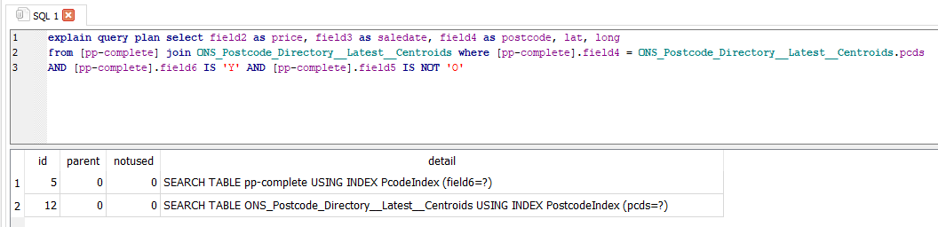
You should be very concerned if you see something like this.
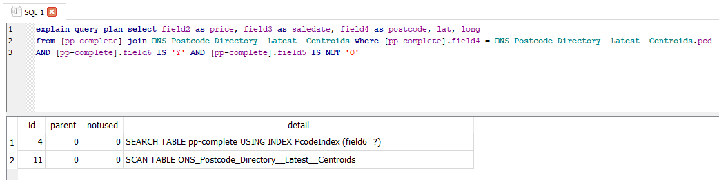
If you run the query and it uses SCAN TABLE instead of SEARCH TABLE USING INDEX you will be waiting so long for it to finish that you will have to quit DB Browser and reload it. This will happen if you haven’t set your indexes properly.
In this case I’ve joined my two tables on the wrong postcode column and there isn’t an index on one of them. If I ran this query it would take a long time, possibly hours, to complete. I would need to quit SQLite and delete the .db-journal file in the same folder as my database to get it working again. Which is of course exactly what happened a few times while I was doing this.
It’s probably useful to say at this point that if you’re working in Windows without show file extensions enabled, you should enable that. If you use a Mac or Linux, there’s probably something similar. Seeing file extensions will make deleting a .db-journal file much easier. And lots else.
So we run our query and, because its indexes are all being used, a few minutes later we’ve got a big list of 2.65 million sales of new build homes since 1995. That’s about 100,000 new sales per year, which is maybe a bit lower than we’d expect, but it’s not awful and it means that our data at least isn’t terrible. It’s always a good idea to check that your data makes sense regularly. I ran a few queries that returned just a few hundred home sales and that was obviously wrong.
Phase 3: Understanding your limitations and preparing yourself for criticism.
At this stage it’s worth remembering that data is never perfect. There are lots of sales that are missing from the prices paid database. There are more sales that are incorrectly classified. There are lots of examples of homes that are built but never sold (think build to rent and social housing of various types) or that are sold in bulk and put onto the prices paid database as one transaction. Or homes that are added to the housing supply but not built (splitting a big home into flats or converting a commercial building). I don’t know how these are counted or whether they’re in the database at all. Using the prices paid database as a proxy for new homes built isn’t a good method. But since there are no good methods this doesn’t necessarily mean that we shouldn’t do it. I like Dan Cookson’s method of using newly assigned postcodes as a proxy for house building, but it has drawbacks too, such as big blocks of flats being given a single postcode. We’ll see that later.
If you share what you are doing on twitter you will get feedback. Some of it will be positive, and some of it will be negative. Some will be extremely useful, and most will be useless.
A hard part about working with data is that most of the feedback will be wrong, and there is no way to know which. If you check every suggestion you will always be checking and never be doing anything. And since most of us learn best by doing, that means we stop learning.
So you need to ignore most feedback. This is hard since most of our culture towards knowledge came from a time when feedback was scarce and it was almost never a good idea to discard it. Since we now need to discard most feedback, we need methods for triaging it. There are no rules that work well, but these are some that I find pretty good,
Good negative feedback tends to come from,
- People with real names, real faces, real locations, and real bios on twitter.
- People who can point to where they or someone else has done the same thing in a better way.
- People who are not rude. This is not the same as being overly polite.
- People who point out precise errors and suggest precise improvements.
Bad negative feedback tends to come from,
- People who dismiss your work as “simplistic”, “naïve”, or “reductive”. I have found requests for more “nuance” so consistently unhelpful that I mute the word on twitter.
- People who repeatedly make the same plausible criticism of your work even after you’ve spent hours checking it and explained why you disagree. Block these people. They are wasting your time and discrediting your efforts. If you mute them they will keep replying and reduce the quality of the feedback you get since others will wonder why you are ignoring their seemingly plausible criticism. Our pre-internet culture says that we shouldn't dismiss criticism or exclude people from debates, but that culture is dead. Block these people and stop thinking about them. You can still interact in real life where older cultural rules will contain their negativity.
- People who ask you to do work that they could do themselves. This includes people who ask for links when a quick google search will find what they’re asking for a link to. If people aren’t willing to put in minimal effort to give you feedback, why do you think their feedback is worthwhile?
But of course none of these rules are perfect. And they themselves will generate lots of negative feedback.
Phase 4: Making something.
2.65 million sales is a lot of sales. Lots of data is hard to play around with, and you’re probably going to have to try and fail a lot of times to do something useful with the data you’ve got. So I’m going to just take a cut of the data for Leeds, which a quick search on Google tells me has local authority code E08000035.
So we run a query,
select field2 as price, field3 as saledate, field4 as postcode, lat, long, oslaua
from [pp-complete] join ONS_Postcode_Directory__Latest__Centroids where [pp-complete].field4 = ONS_Postcode_Directory__Latest__Centroids.pcds
AND [pp-complete].field6 IS 'Y' AND [pp-complete].field5 IS NOT 'O' AND oslaua = 'E08000035'
And save the results using DB Browser for SQLite.
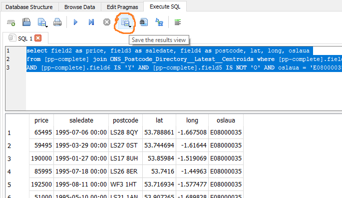
36000 new build home sales is much easier to work with.
The first thing I do is get the data on a map, so I can see if it makes sense. QGIS is a free mapping tool, though please donate if you end up using it a lot. Load the CSV in as delimited text.
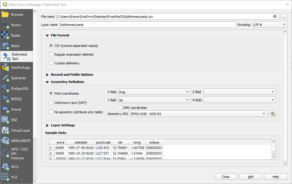
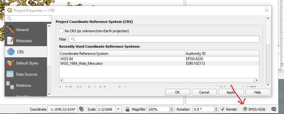
Set your projection to something which looks like what you’ll expect to see on a map (I like anything containing the word “Web Mercator”).
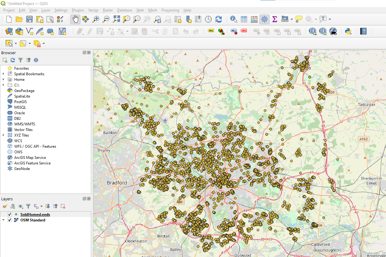
Use the QuickMapServices plugin to add an Open Street Map background so you know where you are and we’re starting to have something that looks good.
The first time I did this I noticed that there were big empty patches in my map. That was because I’d joined my tables on the wrong one of the three postcode columns in the ONS postcode directory. I would have noticed that in Excel, but working in code makes a lot of mistakes much easier to miss. Maps are one of the many checks that help find and fix those mistakes.
So now I’ve got a map and I’m pretty confident that my data is okay. But the map isn’t very useful. I can’t answer questions like “where were most new homes built?” because a huge number of points are overlapping and the points cover most of the map.
QGIS has some great styles that can help display your data more usefully. We’ll mostly use Properties > Symbology and Properties > Labels here.
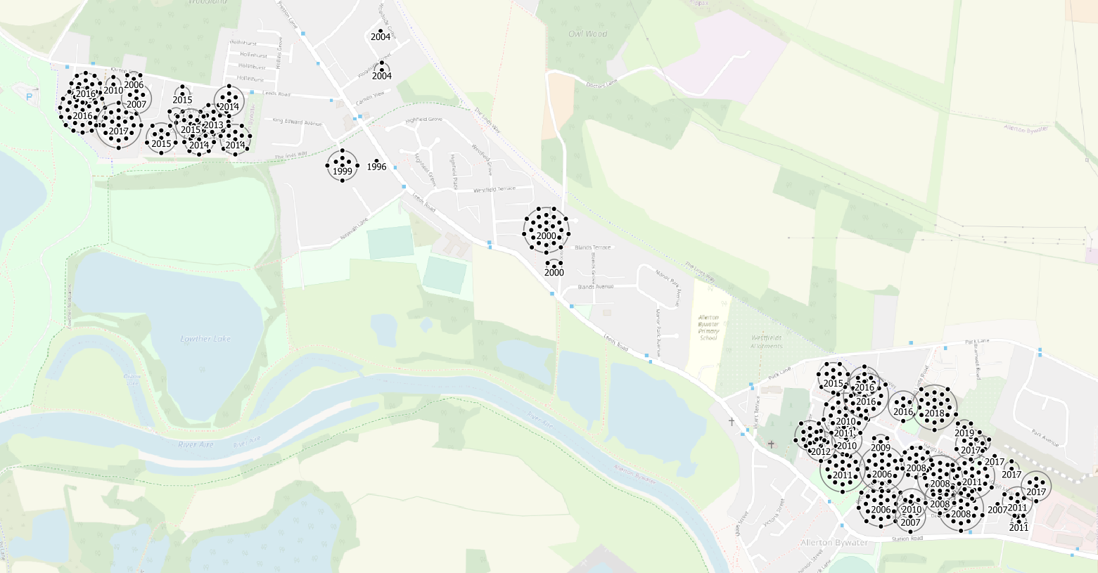
I deal with duplicate points at a single location using point displacement, and add a label to each cluster with the year of sale. (this isn’t perfect because it only displays the year of sale of the central point, but nothing is ever perfect and if you try and make everything perfect you will never get anything done, and it still won’t be perfect).
This is Allerton Bywater. It’s a village in the South East of Leeds. We can see that it built a few dozen new houses centrally in 2000 and then two really big extensions in the West and South East later.
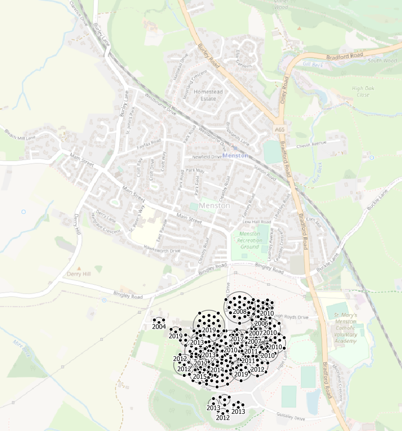
This is Menston. The village itself is in Bradford local authority and so there are no new homes shown in it since we filtered to only show homes built in Leeds local authority. New homes were built in Menston, but they are not shown. Perfect is the enemy of good, I will get negative feedback for including this image, I’ve decided it’s worth it.
The new Southern extension of Menston village is in Leeds local authority and the old West Riding Pauper Lunatic Asylum site has been redeveloped as housing since 2008.
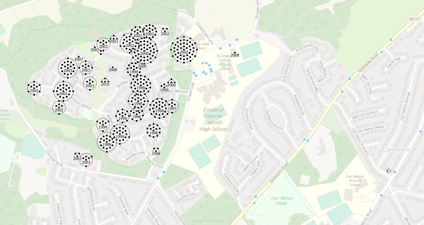
This is an extension of Leeds in Meanwood.
And this is the picture in Leeds City Centre where a huge number of flats have been built at high density, many sharing a single postcode, since 2002.
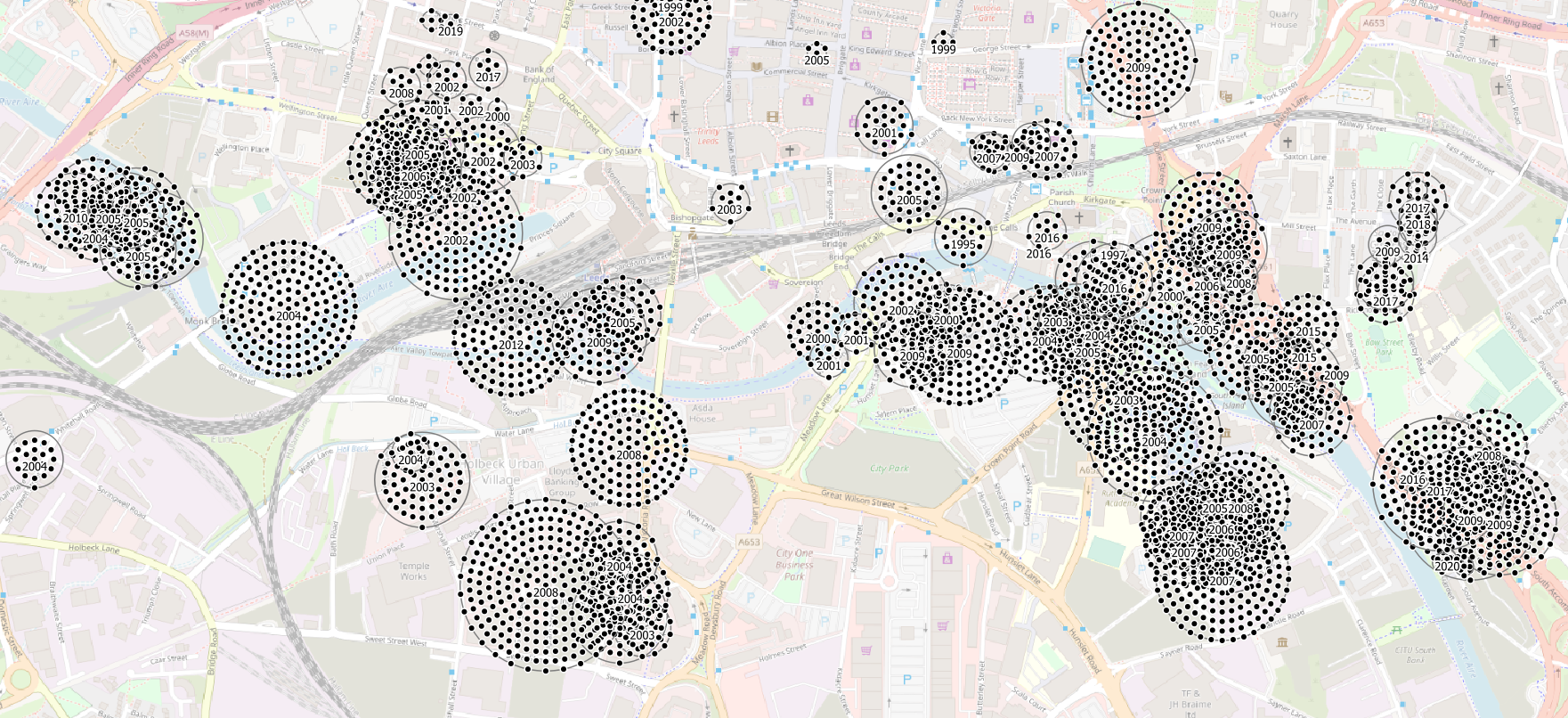
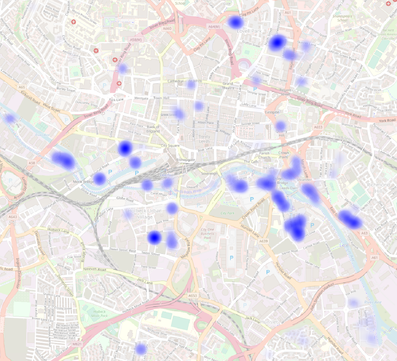
These techniques work well at high zooms, but they still don’t let me answer say where new homes have been built in Leeds since 1995.
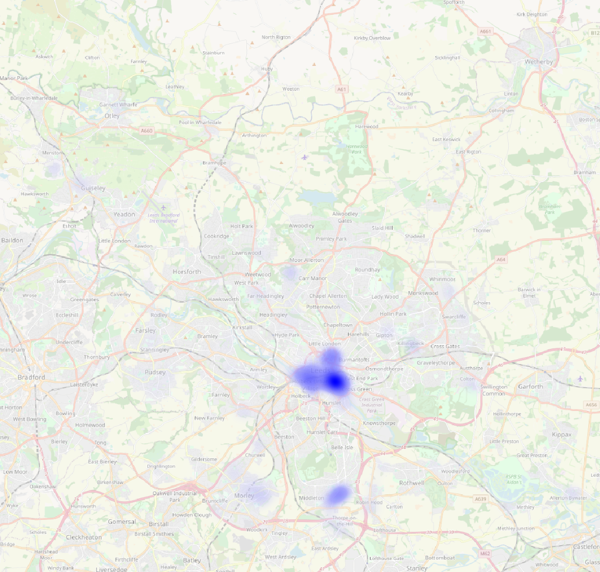
A heatmap does.
And it still works when we zoom in.
Phase 5: Think about what to do next and share your work so someone else can do it.
I’ve used these methods in the past to look at the mix of flats and houses that have been built in Leeds. Using other data I’ve looked at the mix of greenfield and brownfield sites used. I’ve broken down the building by ward. I’ve looked into the future into what’s planned to be built.
But there’s much more that I haven’t done, that other people could do, that I can’t even think of yet. Which is why I’ve written this blog post. I hope it’s useful for some people. I look forward to the good feedback, and I hope I can filter the bad feedback efficiently.
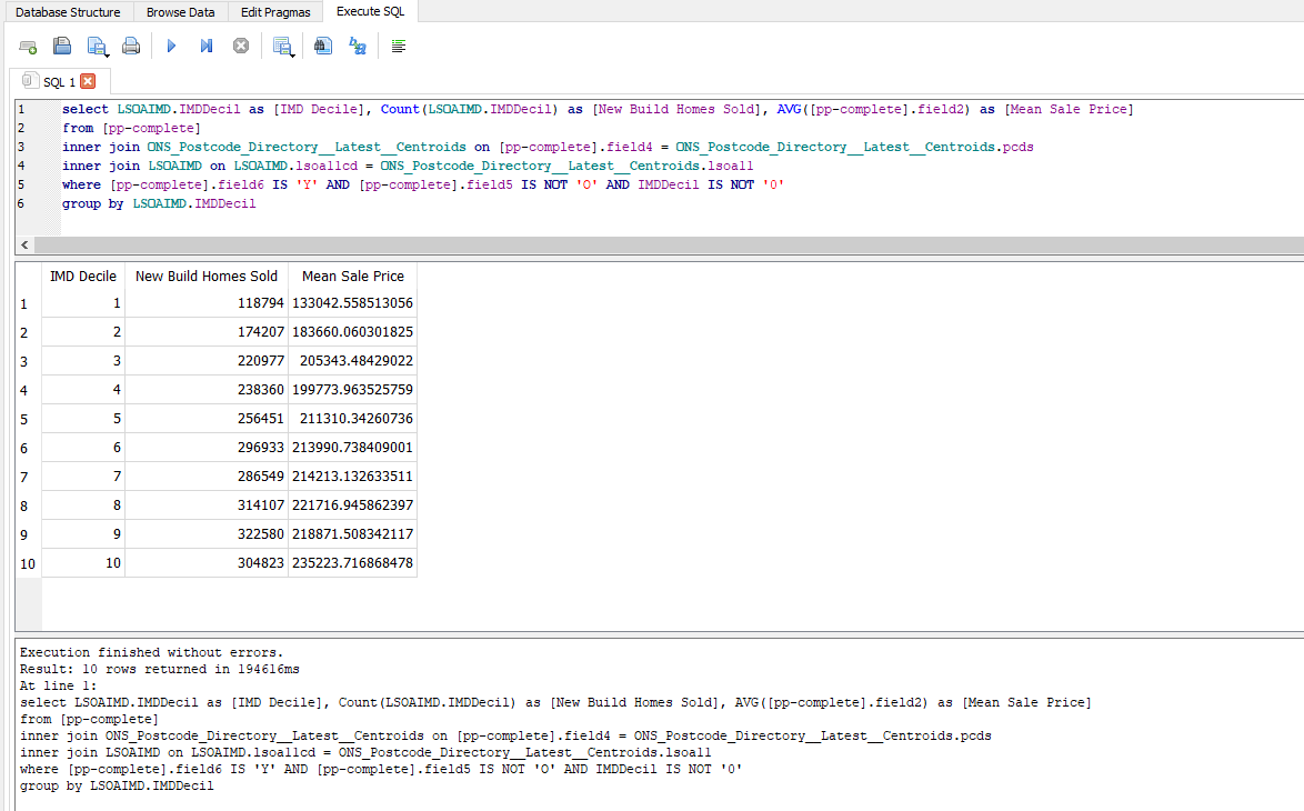
Oh and by the way, here’s how you’d write a query to count the number and average price of new build homes sold in England since 1995 in places grouped by their deprivation decile in 2019.